The Yellow Line: Sea Ice, Open Data, and the Idea of North
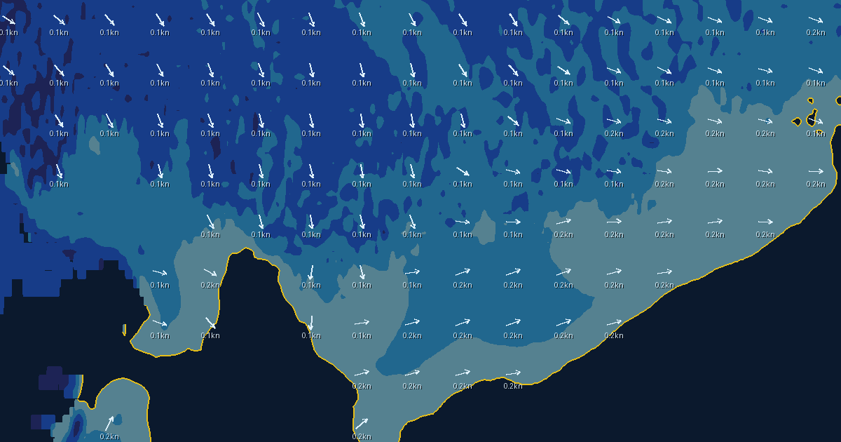
The last change we shipped this week was almost trivial: the modeled sea-ice edge on Vector Weather’s map is now drawn in yellow.
Behind that one line of colour sit about twenty pull requests over ten days — a caching service for a global ocean model, a tile renderer, three production incidents, and one bug that only exists if your software gets close enough to the North Pole to fall off the map. Building it made me think about why a company on the Salish Sea, whose users mostly worry about wind against tide in a narrow pass, felt compelled to draw the ice at all.
The short answer is that we are Canadian, and the ice has always been on our map — whether or not we have ever seen it.
The North we carry around
Canada’s relationship with the Arctic is mostly imaginative. The anthem promises “The True North strong and free.” Glenn Gould opened The Idea of North in 1967 with the observation that the North he cared about was one most Canadians, himself included, would never visit. Stan Rogers gave us “Northwest Passage” in 1981, and it has been treated as a second anthem ever since. John Diefenbaker won an election in 1958 partly on a “Northern Vision” of roads and resources that largely did not materialize.
The Franklin expedition is the sharpest example of how this works. Two Royal Navy ships vanished in 1845 looking for the Northwest Passage, and the search for them became a national preoccupation that outlived the Empire that launched it. When HMS Erebus and HMS Terror were finally found in 2014 and 2016, they were located substantially where Inuit oral history had long said they would be.
That detail is the necessary correction to the whole mythology. The Arctic is not an empty stage for southern imagination. It is Inuit Nunangat — a homeland with communities, languages, and a working knowledge of sea ice that is older, more local, and in many operational respects more precise than anything a satellite produces. Any southern claim on the North that skips this fact is not identity; it is appropriation with a flag on it.
But held honestly, the attachment is real and it is not nothing. A country that keeps the ice in its songs is a country that can be asked to keep the ice in its budgets, its science, and its data.
What the ice looks like as data
Here is what the romantic North looks like from inside a weather platform: a global ocean-physics model on a 1/12-degree grid — cells roughly nine kilometres across — publishing, every day, the fraction of each cell covered by ice and the direction the ice is drifting.
The feed we use comes from the Copernicus Marine Service, the European Union’s ocean-monitoring programme. It is free, open, machine-readable, and global. There is an irony in a Canadian company drawing the Canadian Arctic from a European model, and I think the irony is instructive rather than embarrassing: operational knowledge of the Arctic has become a global commons, assembled from everyone’s satellites and shared back to everyone.
Canada holds up its corner of that commons. The RADARSAT constellation images the ice through cloud and polar darkness, and the Canadian Ice Service — one of the quiet, excellent institutions nobody writes songs about — has human analysts turning that imagery into the ice charts that actual Arctic navigation depends on. A model grid is guidance; an ice analyst is authority. Our map says so plainly: concentration and drift are not thickness, ridging, or a promise that a route is navigable.
Putting it together
The engineering lesson of the month was that you cannot treat a science archive like a web server. When every user’s map click reached toward Copernicus directly, we spent our days managing backlogs and rate limits. The answer was a small, dedicated caching service: once a day it ingests the global fields — currents, waves, ice — and publishes them as immutable snapshots our own infrastructure can serve in milliseconds.
Nothing about that is glamorous. The hardest bug of the whole build was the ingester repeatedly running out of memory on day four of every ten-day cycle, inside a container capped at four gigabytes, and the fix was understanding exactly how a scientific data library schedules its decompression work. This is what “working with data” mostly is: not insight, plumbing.
The map itself went through two generations. The first drew ice as a checkerboard of coloured rectangles, re-sampled every time you moved the map — workable, but blocky, and unstable near the ice edge, where a tiny pan could reshuffle the whole pattern. The second generation moved the drawing to the server: smooth concentration bands rendered into map tiles, drift arrows baked in, the ice edge traced as a single bright line. You can now click anywhere for the modeled concentration at that point, and ask for the ice density along each waypoint of a planned route.
And the pole fought back, as it always has. Our sampling grid snapped to tidy latitude steps, and on tall northern map views it marched right past 90° — requesting data for latitude 99, which does not exist, and failing loudly. Software written in the south breaks at the pole the way southern expeditions always have: by assuming the rules that work at home extend all the way up.
I will also say, because I have argued elsewhere that we should separate evidence from hype about AI: this work was built in collaboration with AI coding agents, with every change landing as a reviewed pull request. Twenty pull requests in ten days for a two-person-equivalent effort is a real number from a real repository, and it is the kind of concrete, checkable claim I wish the AI conversation contained more of.
The moving line
There is a heavier reason the ice edge deserves a colour of its own. The line moves — and on the long axis, it moves in one direction. September Arctic sea-ice extent has been declining by roughly twelve percent per decade against the 1981–2010 average.
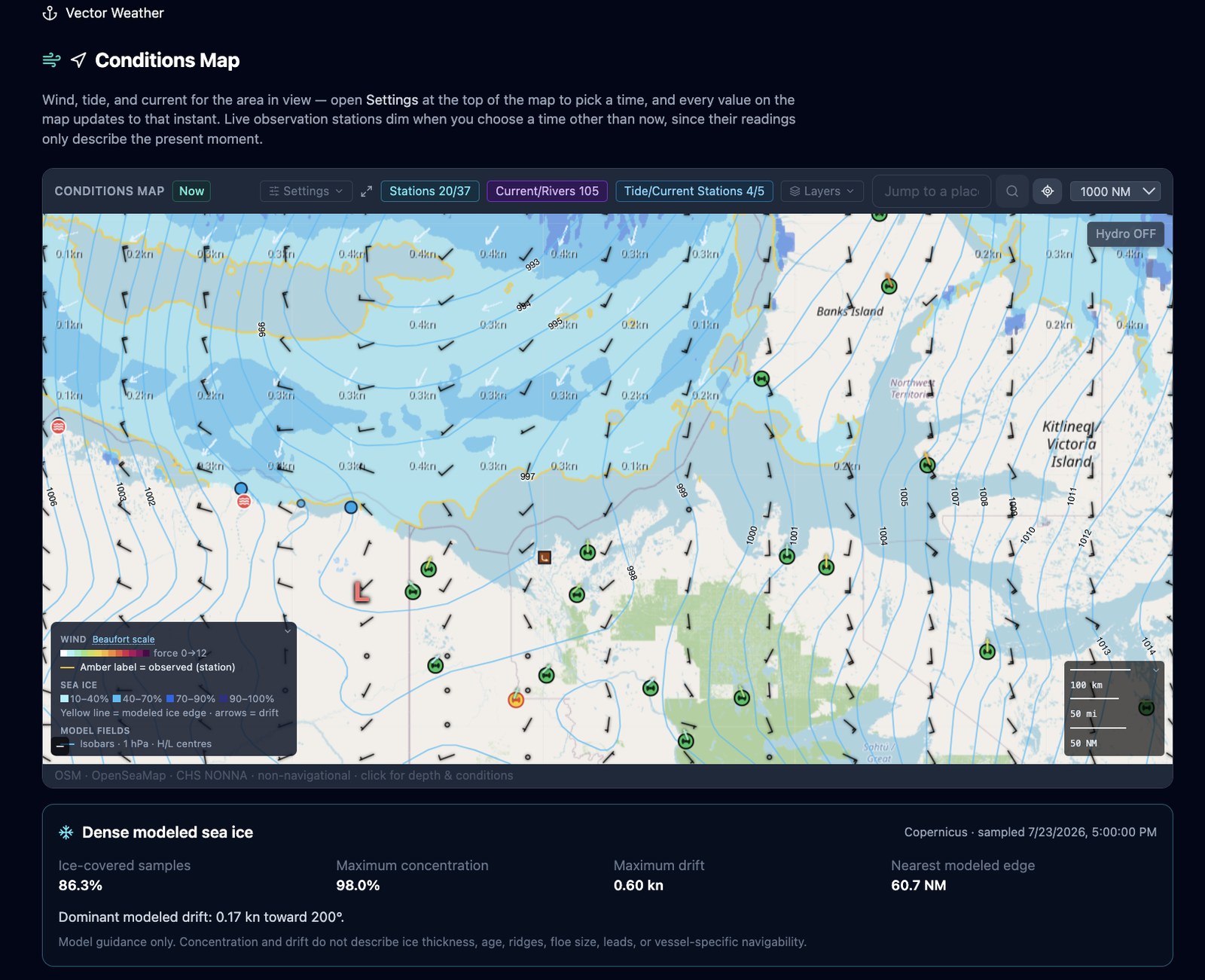
Vector Weather’s current conditions this week: in late July, the modeled ice edge still presses up against the northern Canadian mainland, between Banks Island and Kitlineq (Victoria Island). Maximum concentration in view: 98 percent. Every summer, a few more small vessels attempt the passage Franklin died looking for. The yellow line our servers draw each morning sits, on average, farther north than the one our songs were written about.
I built Vector Weather because thirty years on the water taught me that safety lives in the gap between information that exists and information that reaches you in time. The ice edge is the largest version of that gap I know. The data is open. The satellites — some of them ours — are flying. The institutions that read the ice for a living deserve to be better known and better funded. What a small company can add is attention: keeping the line on the map honest, current, and visible to anyone who looks.
Rogers had it right about what the work is, at every scale from a national dream to a map tile: to trace one warm line through a land so wild and savage. Ours happens to be yellow.